


New Chapter: The Hoodie
The New Chapter hoodie marks more than the arrival of a new Pauzeradio website. It celebrates a complete refresh of the brand. Created through our sister brand, Pauzewear, it brings the redesigned logo and the new mascot’s colours into one piece.
Some of the graphics being replaced had been part of Pauzeradio since its beginning in 2009. Others went back even further, to Gav Pauze’s days in Drum & Bass. The hoodie marks that progression, carrying the new identity into something our readers and listeners can wear.
A Familiar Face Since 2009
The original Pauzeradio logo was designed in 2009. With its lion and vinyl graphic, red, yellow and green background, bold white border and personalised lettering, it became a familiar part of the site and the music shared through it.
For Gav, that original design feels iconic and has earned its place in Pauzeradio’s history.
Its lettering was developed from a personalised font inspired by Pricedown, widely associated with Grand Theft Auto, the popular computer game. It gave the original branding a distinctive character, but the design belonged to an earlier period of Pauzeradio.
The camouflage had an even longer history. The old header used a repeating camouflage tile Gav created in 2005 for his MySpace page, while still working in Drum & Bass, before moving into reggae. That artwork carried through into Pauzeradio and remained part of its appearance for years.
Refreshing the Whole Brand
As the website’s design and functionality were modernised, Gav wanted the graphics to reflect that same progression. That meant updating the visual identity across Pauzeradio, replacing older artwork with designs that fit where the brand is today.
The new appearance uses olive and camouflage greens, warm cream tones and yellow highlights. Camouflage remains part of the identity, with a new pattern replacing the original tile.
The logo has also changed considerably. The multicoloured background and white border have gone, giving the redesigned lion and vinyl graphic a simpler presentation. Yellow now gives the artwork and lettering a consistent presence across the website and other Pauzeradio materials.
Pauzeradio and Pauzewear
Pauzeradio came first. When Gav separated the clothing side into Pauzewear in 2025, the new clothing brand’s lion logo was developed from the existing Pauzeradio identity.
With this latest refresh, Pauzeradio’s branding has been brought into line with the wider Pauze identity. The new Pauzeradio lettering was developed from the same font used for Pauzewear, with each wordmark given its own individual treatment.
The lion graphics share that family connection too, while Pauzeradio retains the vinyl record as a distinct part of its design. Together, the artwork and lettering make the relationship between the sister brands clearer.
From the Mascot to the Hoodie
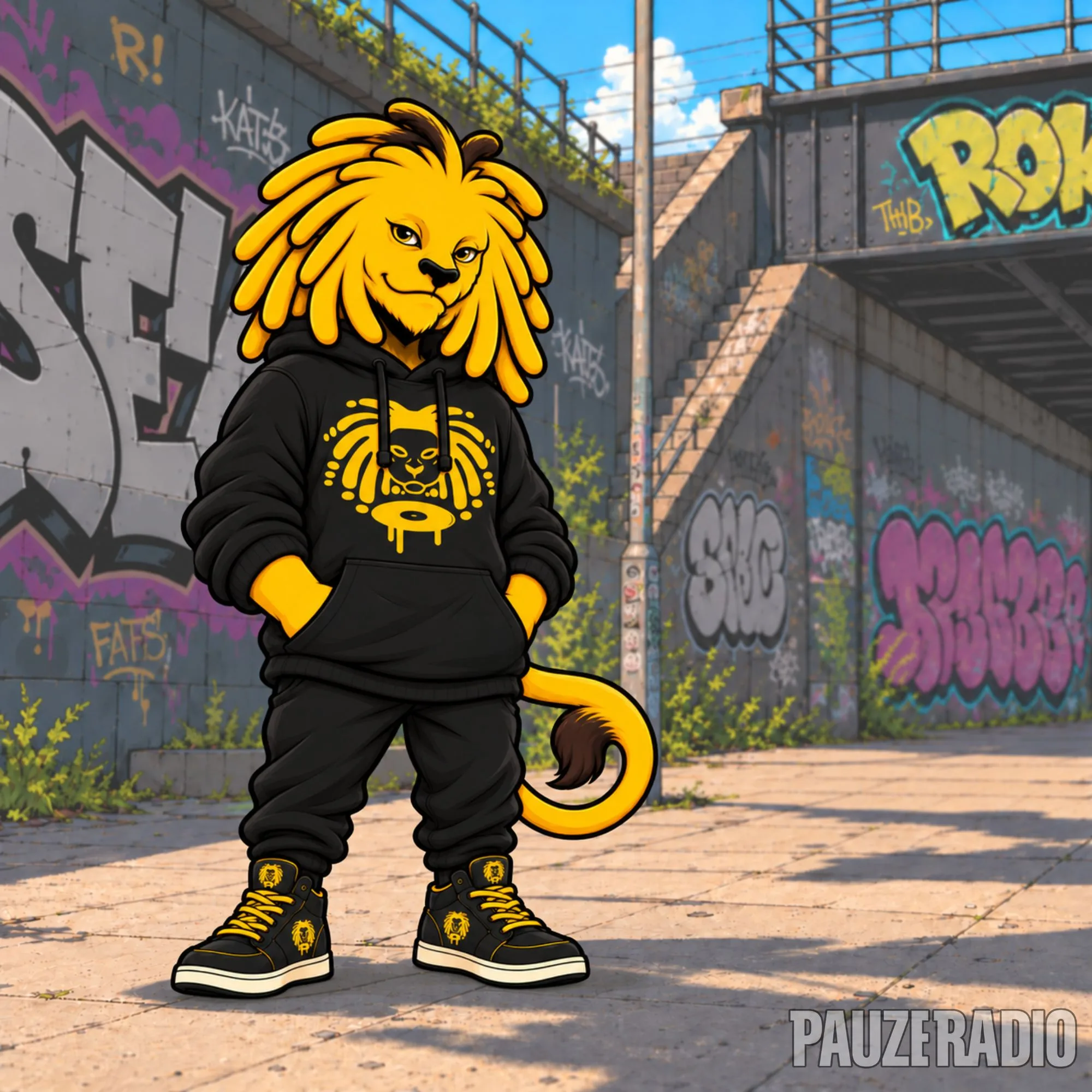
The new Pauzeradio mascot arrived alongside the relaunched website. Its black clothing with yellow detailing provided the inspiration for the New Chapter hoodie’s colour pairing.
The redesigned Pauzeradio lion and vinyl graphic appears in yellow across the chest, standing against the black fabric. A smaller yellow Pauzewear logo sits near the hem, bringing both sister brands onto the same garment.
It connects the new mascot’s clothing with the updated logo, turning elements introduced through the relaunch into a piece people can wear themselves.
Why New Chapter?
New Chapter marks this stage of Pauzeradio’s development and the shared design history behind its relationship with Pauzewear.
Our launch article, The New Pauzeradio Has Arrived, explains the website and its features. The hoodie celebrates the visual identity developed alongside it, taking that new look beyond the screen.
The Pauzeradio New Chapter Hoodie is made from 80% combed ringspun cotton and 20% polyester, featuring the yellow Pauzeradio chest graphic and smaller Pauzewear mark near the hem.
Explore the Pauzeradio New Chapter Hoodie at Pauzewear.